Titanic为Kaggle入门赛之一,类别为二分类的监督模型。
样本数据可自行前往官网下载,csv格式(train + test)
以下为我用R对源字段数据的分析:
get data1
2
3
4
5df_train = read.csv("data/train.csv")%>%
as.data.table()
df_test = read.csv("data/test.csv")%>%
as.data.table()
dataAll = rbind(df_train, df_test, fill = T)
多图绘制1
2
3
4
5
6
7
8
9
10
11
12
13
14
15
16
17
18
19
20
21
22
23
24
25
26
27
28
29
30
31
32
33
34
35multiplot <- function(..., plotlist=NULL, file, cols=1, layout=NULL) {
library(grid)
# Make a list from the ... arguments and plotlist
plots <- c(list(...), plotlist)
numPlots = length(plots)
# If layout is NULL, then use 'cols' to determine layout
if (is.null(layout)) {
# Make the panel
# ncol: Number of columns of plots
# nrow: Number of rows needed, calculated from # of cols
layout <- matrix(seq(1, cols * ceiling(numPlots/cols)),
ncol = cols, nrow = ceiling(numPlots/cols))
}
if (numPlots==1) {
print(plots[[1]])
} else {
# Set up the page
grid.newpage()
pushViewport(viewport(layout = grid.layout(nrow(layout), ncol(layout))))
# Make each plot, in the correct location
for (i in 1:numPlots) {
# Get the i,j matrix positions of the regions that contain this subplot
matchidx <- as.data.frame(which(layout == i, arr.ind = TRUE))
print(plots[[i]], vp = viewport(layout.pos.row = matchidx$row,
layout.pos.col = matchidx$col))
}
}
}
sex1
2
3
4
5
6
7
8
9
10
11
12
13
14
15sex_analysis = function(trainDf){
a<-CrossTable(trainDf$Sex, trainDf$Survived)
par(mfrow=c(1,2))
barplot(a$t[,2], beside = TRUE,
sub = "survival count of both sexes",
ylab = "survival count", xlab = "Sex",
ylim = c(0,250),col = c("mistyrose","lightblue")) # 250 shall change
barplot(a$prop.row[,2], beside = TRUE,
sub = "survival rate of both sexes",
ylab = "survival rate", xlab = "Sex",
ylim = c(0,0.80),col = c("mistyrose","lightblue")) # 0.8 shall change
}
sex_analysis(df_train)
age1
2
3
4
5
6
7
8
9
10
11
12
13
14
15
16
17age_analysis = function(trainDf){
ageDf = trainDf[!is.na(trainDf$Age),]
ageDf$Age = as.integer(ageDf$Age)
survivedDf = ageDf[ageDf$Survived == 1]
m=seq(0,max(ageDf$Age),by=5)
survivedAge=cut(survivedDf$Age,m)%>%table%>%data.frame
ageDfAge=cut(ageDf$Age,m)%>%table%>%data.frame
survivedAge = data.frame(survivedAge, round(survivedAge$Freq/ageDfAge$Freq, digits = 4))
colnames(survivedAge)=c('Age','count', 'prop')
# aveRate = sum(survivedAge$prop[1:13])/13
p1 <- ggplot(data = survivedAge,aes(x =Age,y=count)) + geom_bar(stat = 'identity') + ggtitle("age distribution of survivors")
p2 <- ggplot(data = survivedAge,aes(x =Age,y=prop)) + geom_bar(stat = 'identity') + ggtitle("age freq distribution of survivors")
multiplot(p1, p2)
}
age_analysis(df_train)

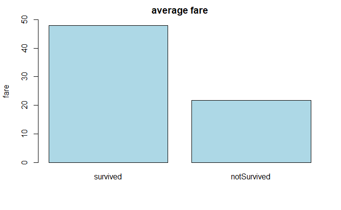
fare1
2
3
4
5
6
7
8
9
10
11
12
13
14
15
16
17
18
19fare_analysis = function(trainDf){
trainDf$Fare = as.integer(trainDf$Fare)
survivedDf = trainDf[trainDf$Survived == 1]
notSurvivedDf = trainDf[trainDf$Survived == 0]
survivedFare = survivedDf$Fare%>%table%>%data.frame
colnames(survivedFare) = c('Fare', 'Count')
notSurvivedFare = notSurvivedDf$Fare%>%table%>%data.frame
colnames(notSurvivedFare) = c('Fare', 'Count')
p1 <- ggplot(data = survivedFare,aes(x =Fare,y=Count)) + geom_bar(stat = 'identity') + ggtitle("fare distribution of survivors")
p2 <- ggplot(data = notSurvivedFare,aes(x =Fare,y=Count)) + geom_bar(stat = 'identity') + ggtitle("fare distribution of NOT survivors")
p3 <- barplot(height = cbind('survived'= mean(survivedDf$Fare), 'notSurvived' = mean(notSurvivedDf$Fare)),
main = 'average fare', ylab = 'fare', ylim = c(0,50),col = "lightblue") # 50 shall change
multiplot(p1, p2)
}
fare_analysis(df_train)

pclass1
2
3
4
5
6
7
8
9
10
11
12
13
14
15pclass_analysis = function(trainDf){
a <- CrossTable(trainDf$Pclass, trainDf$Survived)
par(mfrow=c(1,2))
barplot(a$t[,2], beside = TRUE,
sub = "survival count of pclass",
ylab = "survival count", xlab = "pclass",
ylim = c(0,140),col = c("mistyrose","lightblue","lightyellow")) # 250 shall change
barplot(a$prop.row[,2], beside = TRUE,
sub = "survival rate of pclass",
ylab = "survival rate", xlab = "pclass",
ylim = c(0,0.70),col = c("mistyrose","lightblue","lightyellow")) # 0.8 shall change
}
pclass_analysis(df_train)

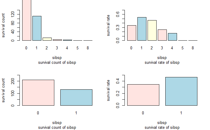
sibsp1
2
3
4
5
6
7
8
9
10
11
12
13
14
15
16
17
18
19
20
21
22
23
24
25sibsp_analysis = function(trainDf){
trainDf = data.frame(trainDf, sibsp = ifelse(trainDf$SibSp>0, 1, 0))
a <- CrossTable(trainDf$SibSp, trainDf$Survived)
b <- CrossTable(trainDf$sibsp, trainDf$Survived)
par(mfrow=c(2,2))
barplot(a$t[,2], beside = TRUE,
sub = "survival count of sibsp",
ylab = "survival count", xlab = "sibsp",
ylim = c(0,140),col = c("mistyrose","lightblue","lightyellow")) # 250 shall change
barplot(a$prop.row[,2], beside = TRUE,
sub = "survival rate of sibsp",
ylab = "survival rate", xlab = "sibsp",
ylim = c(0,0.70),col = c("mistyrose","lightblue","lightyellow")) # 0.8 shall change
barplot(b$t[,2], beside = TRUE,
sub = "survival count of sibsp",
ylab = "survival count", xlab = "sibsp",
ylim = c(0,250),col = c("mistyrose","lightblue","lightyellow")) # 250 shall change
barplot(b$prop.row[,2], beside = TRUE,
sub = "survival rate of sibsp",
ylab = "survival rate", xlab = "sibsp",
ylim = c(0,0.50),col = c("mistyrose","lightblue","lightyellow")) # 0.8 shall change
}
sibsp_analysis(df_train)
Parch1
2
3
4
5
6
7
8
9
10
11
12
13
14
15
16
17
18
19
20
21
22
23
24
25Parch_analysis = function(trainDf){
trainDf = data.frame(trainDf, parch = ifelse(trainDf$Parch>0, 1, 0))
a <- CrossTable(trainDf$Parch, trainDf$Survived)
b <- CrossTable(trainDf$parch, trainDf$Survived)
par(mfrow=c(2,2))
barplot(a$t[,2], beside = TRUE,
sub = "survival count of Parch",
ylab = "survival count", xlab = "Parch",
ylim = c(0,140),col = c("mistyrose","lightblue","lightyellow")) # 250 shall change
barplot(a$prop.row[,2], beside = TRUE,
sub = "survival rate of Parch",
ylab = "survival rate", xlab = "Parch",
ylim = c(0,0.70),col = c("mistyrose","lightblue","lightyellow")) # 0.8 shall change
barplot(b$t[,2], beside = TRUE,
sub = "survival count of Parch",
ylab = "survival count", xlab = "Parch",
ylim = c(0,250),col = c("mistyrose","lightblue","lightyellow")) # 250 shall change
barplot(b$prop.row[,2], beside = TRUE,
sub = "survival rate of Parch",
ylab = "survival rate", xlab = "Parch",
ylim = c(0,0.50),col = c("mistyrose","lightblue","lightyellow")) # 0.8 shall change
}
Parch_analysis(df_train)

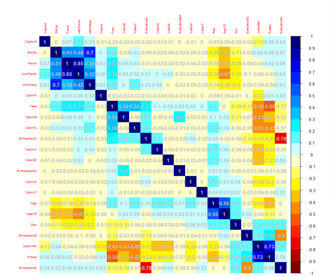
corr1
2
3
4
5
6
7
8
9
10
11
12
13
14
15
16
17
18col1 <- colorRampPalette(c("#7F0000","red","#FF7F00","yellow","white",
"cyan", "#007FFF", "blue","#00007F"))
col2 <- colorRampPalette(c("#67001F", "#B2182B", "#D6604D", "#F4A582", "#FDDBC7",
"#FFFFFF", "#D1E5F0", "#92C5DE", "#4393C3", "#2166AC", "#053061"))
col3 <- colorRampPalette(c("red", "white", "blue"))
col4 <- colorRampPalette(c("#7F0000","red","#FF7F00","yellow","#7FFF7F",
"cyan", "#007FFF", "blue","#00007F"))
wb <- c("white","black")
par(ask = TRUE)
#-----------------------
# correlation analysis
# cov = covariance matrix
# cor = correlation matrix
M<-cor(train)
corrplot(M, method="color", col=col1(20), cl.length=21,order = "AOE",tl.cex = 0.6,,addCoef.col="grey")